
I’ve seen prior posts on this with people indicating that there is no option for adjusting the values.  Somehow I’ve got them at two different sizes, but I cannot find anything I’ve done differently.  Does anybody have any guidance, since I literally cannot read the axis labels in the plot on the right?


Hi Dan,

The reason the right Universal Plot’s text looks smaller is because of the y-axis dependent variable.  You directly chose NSRA and filled in the values in the settings for the Universal Plot.  If you want the labels to be more visible, I would suggest placing the NSRA directly in the MFE and then use the Line drop down to select NSRA.  This way, things like Surface, Src, Data, etc are not printed on the y-axis.


@MichaelH  This is an annoying feature and could probably benefit from a formatting update.

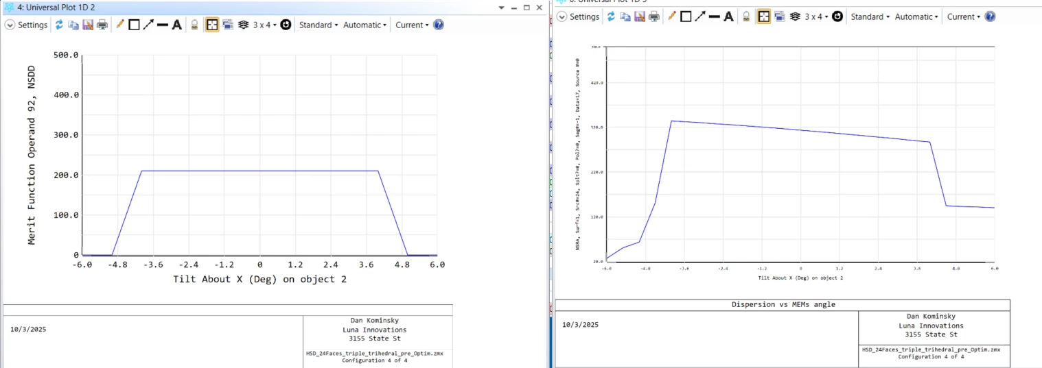
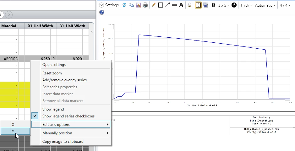
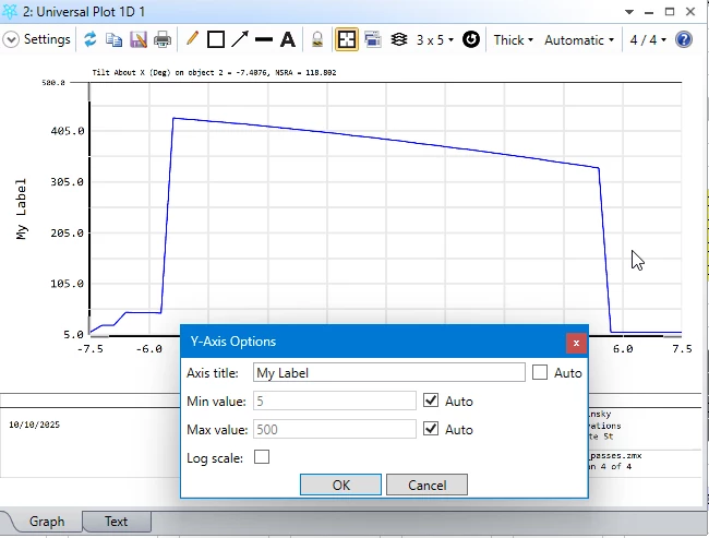
Why is it necessary to print all of the settings on the Y axis? Could they go into the lower box in the frame? Most analysis windows have details printed there. 

Why does the font size of both axis values need to decrease with the y axis label? It’s the numbers on the axis that are the most valuable to see at a glance. When copying and pasting into another document, it can be unreadable sometimes. 

I think this has been discussed in the past, but why should we need to export raw data to other programs just to generate readable graphics?