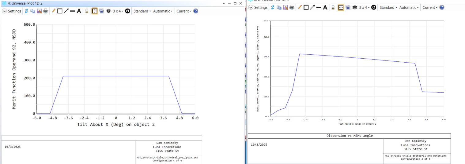
@MichaelH This is an annoying feature and could probably benefit from a formatting update.
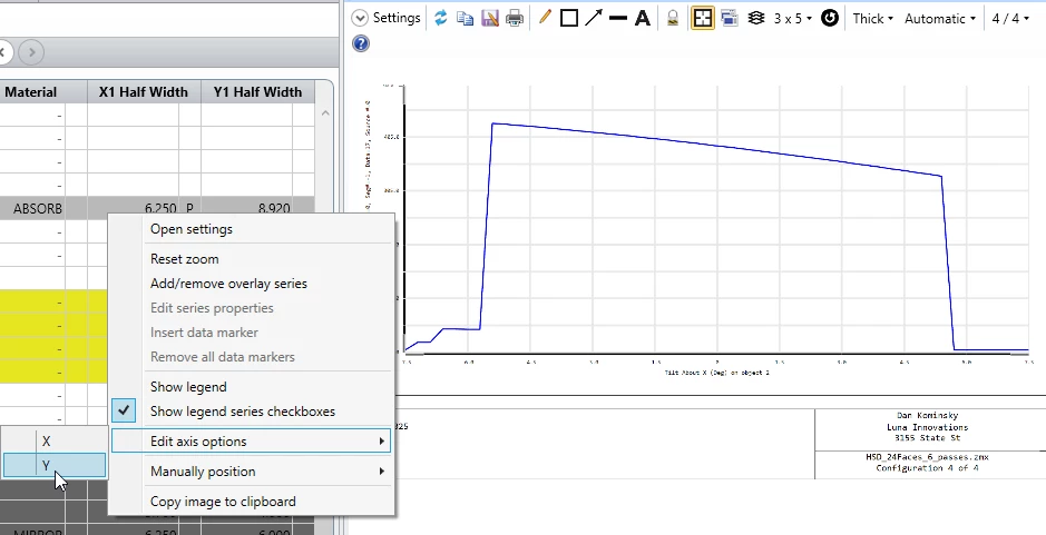
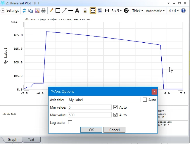
Why is it necessary to print all of the settings on the Y axis? Could they go into the lower box in the frame? Most analysis windows have details printed there.
Why does the font size of both axis values need to decrease with the y axis label? It’s the numbers on the axis that are the most valuable to see at a glance. When copying and pasting into another document, it can be unreadable sometimes.
I think this has been discussed in the past, but why should we need to export raw data to other programs just to generate readable graphics?


